Geography 100
Tuesday, December 10, 2019
My Experience Creating Interactive Web Maps
This was a fun learning experience. I enjoyed this lab. I decided to do my web maps on one of my favorite topics Mexican restaurants. I love Mexican Food! Last week I met up with my high school football buddies at Xolo, our favorite place. We discussed my upcoming lab, while we drank Tequila and ate some samples of Mexican Street Food. We voted on the best of them. I then made two maps. Here's the link check them out.
Story Map
Web Map
I also learned a little bit about coding HTML. I found it easy but a bit tedious. Here is a link to my webpage.https: people.emich.edu/gchristo/chgweb
Thursday, November 21, 2019
Blog 7 My Experience Collecting Data with GPS
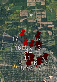
For this lab we were asked to find and map the location of fire hydrants in Google Earth and make a map by uploading a CVS file to Arcgis Online. I used my phone's GPS application. It was very easy to read my cordinates with my phone's application. Creating a KML file and displaying it in Google Earth was also a simple process.
 Google Earth placed most of my hydrants in the middle of the streets. By using Google Earth ruler I estimate that most of my cordinates were off by 5 to 10 meters.
Uploading a CVS file to Arcgis Online was also a fast and simple process. My Map Arcgis Online
If you zoom in on my map you can see that Arcgis Online placed my hydrants closer to their actual positions. I found this lab to be very user friendly and can imagine many ways to use this in many fields.

Uploading a CVS file to Arcgis Online was also a fast and simple process. My Map Arcgis Online
If you zoom in on my map you can see that Arcgis Online placed my hydrants closer to their actual positions. I found this lab to be very user friendly and can imagine many ways to use this in many fields.
Thursday, November 7, 2019
My Experience Combining Attribute and Spatial Queries
Like several of my classmates, this lab was a bit difficult for me. Arcgis has the ability to do so many things and is very useful for anyone needing to make a map. I found that as long as I had step by step instructions I was able to understand and complete the task and apply it to other tasks as long as the process was the same. I had to keep going back to other lessons to complete many of the tasks and rework some things. Part of my problem was I had quite a busy week and had to do the lab over several days and my laptop is having issues. I believe with repetition I will soon zoom through the tasks. I hope to make time to follow some of the tutorials on Ersi. I found alot of YouTube clips dealing with Arcgis. I think watching and creating maps along with some of the YouTube tutorials and lessons would also be of benefit to me.
Tuesday, October 29, 2019
Site Suitability Analysis GIS
Site Suitability Analysis is the process of determining the best or most appropriate area for particular use. GIS programs can examine and combine data from many sources to determine the area most suited by narrowing down locations to specific criteria. This process is useful in determining building sites such as schools, shopping centers, and any building project. Site Suitability Analysis can be used for much more than determining the appropriate site for a building. In marketing it could be used to narrow demographics for certain products and services. Another use would be to provide information for social programs or health agencies. Below I have included two links to show Site Suitability Analysis in action. The first link is to Flo Analytics a company that uses GIS to provide solutions for companies, governments and social organizations. By examining some of their projects you will get a better idea of Site Suitability Analysis many real-world applications. https://www.flo-analytics.com/services/
The next link shows how Site Suitability Analysis was used in planing urban services in India. https://www.sciencedirect.com/science/article/pii/S2226585617301231
The next link shows how Site Suitability Analysis was used in planing urban services in India. https://www.sciencedirect.com/science/article/pii/S2226585617301231
Thursday, October 24, 2019
Map Design Principles with Map Critique
Map design Principles are a set of general guidelines to help the cartographer to make maps that are easily able to be understood. The chief map design Principles are
Visual Hierarch
Overall balance
Contrast
Clarity
Focus of attention
Unity and Harmony As we learn more about map making we need to keep these basics in mind. Recently, I came across this map on a site dedicated to matters of air quality in the UK. The first thing I noticed was that that the map lacked a title or any kind of scale or key to let the viewers understand the what are focus of attention should be. There isn't a clear idea of what this map is trying to explain other than a brightly colored UK. The overall balance of the map is acceptable. The images is centered just above the page center. The colors are pleasing and the contrast of colors would be helpful to the viewer to understand the data represented if we had any idea of what that data was. By reading the article, I was able to understand that the map was supposed to document the upcoming weeks level of air pollution. The map does little to show the amount of air pollution. I am assuming that the areas in red are the areas of high pollution. I would have like to see some sort of text telling me the name of towns or landmarks to better understand the areas of high air pollution. The above map is a perfect example of why we need to take into account map design Principles. It is a poor representation.
Wednesday, October 9, 2019
Blog 4 My Experience Creating a Thematic Map
Monday, September 30, 2019
Ellipsoids Datums And Projections
The Earth's shape is closest to an ellipsoid. It is wider in the middle and smaller at the poles.
The Earth is not a perfect ellipsoid. And hard to measure. Over time due to the changing shape of the Earth and newer more accurate technology we have created and use different Ellipsoid maps.
A datum is a reference point. It is used to show positions on maps to it's real position on the Earth. Horizontal Datums measure latitude and longitude. Vertical datum are used to measure depth. Because the Earth is not a perfect ellipsoid Datums provide a more accurate picture of the area.
A map projection is a way to show the shape of the Earth on a flat surface. Map projections have distortions such as size, shape, angle, and distance. It is important to pick the right map to show what you need.
The biggest problem I had when using Google Earth had to do with my own error in numbers.
Subscribe to:
Comments (Atom)


